
 Lioli
Lioli


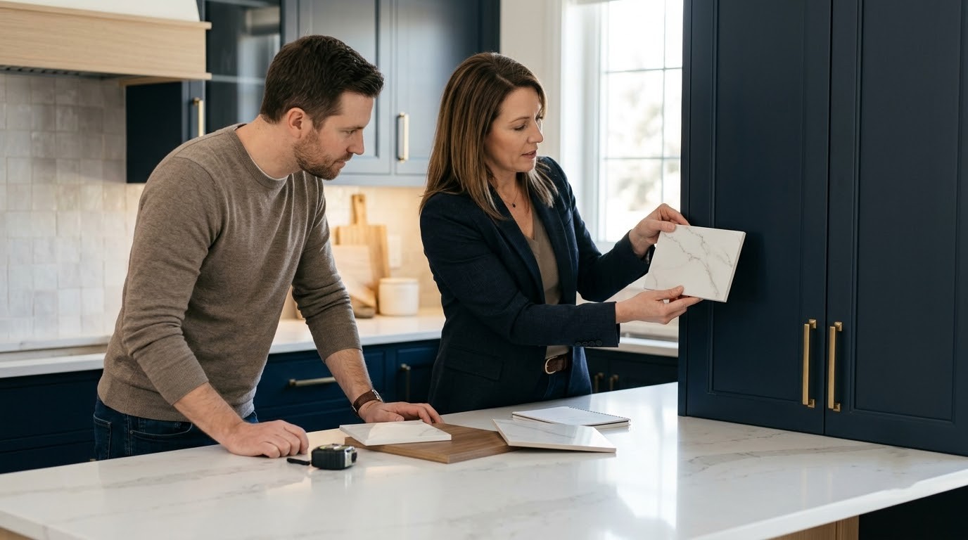
A kitchen works best when its major surfaces feel connected. Cabinets establish much of the room’s visual identity, while countertops occupy a prominent horizontal plane that immediately draws attention. Coordinating these two elements can create a kitchen that feels balanced, sophisticated, and intentionally designed. The goal is not always to match the countertop and cabinetry exactly. Instead, successful design comes from combining color, undertones, texture, pattern, hardware, lighting, and proportion in a thoughtful way.
Porcelain countertops offer considerable design flexibility because they can replicate the visual character of natural stone, concrete, marble, and other contemporary materials while providing a wide range of colors and surface appearances. Whether the kitchen features warm wood cabinetry, minimalist white doors, dark finishes, or a combination of materials, the countertop can either quietly support the cabinetry or become the room’s central visual feature. Careful coordination helps both elements work together rather than compete for attention.
Why is Coordination Between Cabinets and Countertops Important?
Kitchen cabinets and countertops occupy large visual areas. If their colors and patterns clash, the entire kitchen can feel disconnected. If they coordinate too closely, however, the room may appear flat or monotonous.
A successful combination usually creates a clear hierarchy:
- One element becomes the dominant visual feature.
- The second element provides balance.
- Hardware and fixtures introduce smaller accents.
- Flooring and walls connect the overall palette.
This approach gives each material a role instead of allowing every surface to compete.
Start With the Countertop or Cabinets?
There is no universal rule. Your starting point should depend on which material has already been selected.
If the countertop has dramatic veining or a strong pattern, select the cabinets afterward so they support the surface. If you have already committed to distinctive cabinetry, choose a countertop that complements rather than competes with it.
When the Countertop Is the Focal Point
A marble-inspired porcelain surface with expressive veining can become the kitchen’s main design feature. In this situation, consider simple cabinet colors such as:
- Warm white
- Soft grey
- Cream
- Taupe
- Natural wood
- Deep neutral shades
This allows the countertop pattern to remain visible without creating visual clutter.
When Cabinets Are the Focal Point
If the cabinetry includes bold colors, unusual textures, fluted details, or prominent wood grain, a quieter countertop may work better.
A subtle stone-effect or neutral porcelain surface can provide contrast without taking attention away from the cabinets.
Understand Color Undertones
Color matching involves more than choosing two surfaces that appear similar.
Warm Undertones
Warm surfaces may contain subtle hints of cream, beige, yellow, brown, or warm grey. They generally coordinate well with:
- Natural wood
- Cream cabinetry
- Warm beige
- Bronze hardware
- Brass accents
Cool Undertones
Cool surfaces may lean toward blue, green, or cooler grey. These can work effectively with:
- Crisp white cabinetry
- Cool grey
- Black accents
- Stainless steel
- Chrome fixtures
Why Do Undertones Matter?
Imagine a warm cream countertop beside a distinctly blue-grey cabinet. Both colors may appear neutral independently, but together they can feel disconnected.
Always compare physical samples where possible and view them under the kitchen’s actual lighting.
How to Coordinate Porcelain Countertops With White Cabinets
White cabinetry provides a versatile foundation, making it easier to introduce personality through the countertop.
White-on-White
A white or soft-white porcelain surface can create a bright, seamless appearance. To avoid a sterile look, introduce variation through:
- Wood flooring
- Textured backsplash
- Warm lighting
- Natural accessories
- Contrasting hardware
White Cabinets With Veined Porcelain
A marble-inspired porcelain countertop can add movement and sophistication to white cabinetry. Choose a vein color that relates to another element in the room, such as the flooring, hardware, backsplash, or lighting.
This creates a subtle visual connection.
Coordinating Porcelain Countertops With Wood Cabinets
Wood cabinetry introduces natural warmth and variation. The countertop should complement its dominant tone rather than fight against the grain.
Light Wood Cabinets
Oak, ash, and other lighter wood tones can pair with:
- Cream
- Warm white
- Beige
- Soft grey
- Light stone-inspired surfaces
Dark Wood Cabinets
Darker cabinetry can create a dramatic kitchen when paired with lighter porcelain countertops. The contrast helps define the countertop and prevents the cabinetry from making the room feel too heavy.
A lighter surface can also reflect more light and contribute to a balanced overall composition.
Coordinating Porcelain Countertops With Dark Cabinets
Dark cabinets can create a sophisticated and contemporary atmosphere, but they require careful balancing.
A lighter porcelain countertop can establish contrast and prevent the kitchen from appearing visually dense. Alternatively, a darker countertop can create a dramatic monochromatic effect.
If both cabinets and countertops are dark, consider introducing lighter walls, flooring, backsplash elements, or lighting to maintain visual depth.
How Pattern and Veining Affect Cabinet Selection
Not every porcelain countertop needs plain cabinetry.
The important consideration is the strength of the pattern.
Subtle Veining
A countertop with fine, understated veining can work with slightly more expressive cabinetry or textured wood.
Dramatic Veining
Strong, flowing veins usually need calmer surrounding materials. Simple cabinet fronts allow the countertop to become the primary feature.
Large-Format Patterns
Large porcelain surfaces can display patterns across expansive areas. Designers should consider how the pattern will appear around:
- Islands
- Sink cut-outs
- Hob openings
- Corners
- Backsplashes
- Counter edges
Pattern direction and slab layout can influence the final appearance significantly.
Coordinate Countertops With Kitchen Hardware
Hardware may be smaller than cabinets and countertops, but it can connect the entire design.
Common finishes include:
- Matte black
- Brushed brass
- Chrome
- Stainless steel
- Bronze
- Brushed nickel
Should Hardware Match the Countertop?
Not necessarily. Instead, select hardware that complements the countertop and cabinet palette.
For example, warm porcelain surfaces can pair naturally with brass or bronze accents, while cool grey surfaces can work well with stainless steel, chrome, or matte black.
Try to limit the number of competing metal finishes unless the design intentionally uses multiple accents.
Use the Backsplash as a Connecting Element
The backsplash can bridge the visual gap between cabinets and countertops.
You can use:
- The same porcelain surface as the countertop.
- A complementary porcelain design.
- A contrasting tile.
- A neutral surface that allows the countertop to dominate.
Using the same surface for the countertop and backsplash can create a continuous appearance, particularly with large-format porcelain.
Consider Kitchen Size and Proportion
The size of the kitchen can influence how strongly the countertop pattern should appear.
Small Kitchens
Smaller kitchens often benefit from lighter colors and controlled patterns. A large, dramatic pattern can work, but surrounding surfaces should remain relatively simple.
Large Kitchens
Larger kitchens provide more space for bold veining, contrasting cabinets, and statement islands. However, proportion remains important.
An oversized island with a dramatic countertop can become the visual centerpiece, so the surrounding cabinetry should support it rather than compete.
Coordinate Countertops With Flooring
Flooring forms another large visual surface. It does not need to match the countertop, but it should relate to it.
If the countertop features strong movement, consider a quieter floor. If the countertop is relatively plain, flooring can introduce subtle texture.
Repeating one color from the countertop in the flooring can also create cohesion.
Lighting Can Change the Entire Palette
Lighting influences how porcelain and cabinet colors appear.
Natural daylight can reveal undertones that artificial lighting may hide. Warm artificial light can make beige and cream surfaces appear warmer, while cooler lighting can emphasize grey and white tones.
For this reason, evaluate countertop and cabinet samples at different times of day before making the final decision.
Frequently Asked Questions
Should porcelain countertops match kitchen cabinets?
They do not need to match exactly. Complementary or contrasting colors can create a more balanced and visually interesting kitchen.
What cabinet colors work best with porcelain countertops?
White, cream, grey, natural wood, taupe, and dark cabinetry can all work well. The best choice depends on the countertop’s color, undertone, pattern, and finish.
Can porcelain countertops be used with wooden cabinets?
Yes. Porcelain surfaces can complement natural wood effectively when designers coordinate undertones and visual weight.
Should the backsplash match the porcelain countertop?
It can, but it does not have to. Using the same surface can create continuity, while a complementary backsplash can introduce controlled contrast.
How do I calculate how much porcelain I need for a countertop?
Measure each countertop section, calculate the individual areas, and add them together. However, the final slab requirement depends on the cutting layout, openings, pattern direction, and fabrication requirements.
Can a dark cabinet work with a light porcelain countertop?
Yes. This combination creates strong contrast and can make the countertop a visual focal point. Lighter walls, flooring, or backsplash materials can help maintain balance.
Is porcelain suitable for kitchen countertops?
Certain porcelain products are specifically designed for countertop applications. Always verify the manufacturer’s technical specifications and fabrication recommendations for the selected product.
How Lioli Ceramica Supports Contemporary Kitchen Design
Lioli Ceramica offers large-format porcelain surfaces in contemporary designs, textures, formats, and finishes for modern architectural and interior applications. Its surfaces provide architects, interior designers, contractors, and homeowners with options for developing coordinated kitchen concepts.
From subtle neutral surfaces to expressive stone-inspired patterns, the right porcelain selection can complement different cabinet styles and kitchen palettes. Careful coordination allows the countertop to work as part of a larger design system involving cabinetry, backsplash, flooring, hardware, lighting, and décor.
Conclusion
Coordinating porcelain countertops with kitchen cabinets requires more than matching two colors. A successful kitchen considers undertones, pattern intensity, surface texture, proportions, hardware, backsplash, flooring, and lighting as connected parts of one design. When one element becomes the visual focus and the others provide support, the kitchen can feel sophisticated without becoming visually overwhelming. Accurate measurements and professional fabrication also remain essential for achieving a successful countertop installation.
Lioli Ceramica provides contemporary porcelain surface solutions that give architects, designers, contractors, and homeowners flexibility when developing modern kitchen interiors. With varied designs, formats, textures, and finishes, Lioli Ceramica can support different cabinet styles and design directions, from warm natural kitchens to minimalist spaces and dramatic contemporary concepts. Thoughtful surface coordination can turn the kitchen into a cohesive, functional, and visually distinctive environment.